For more information on raster grid layers and their use, see How to work with Raster Data?.
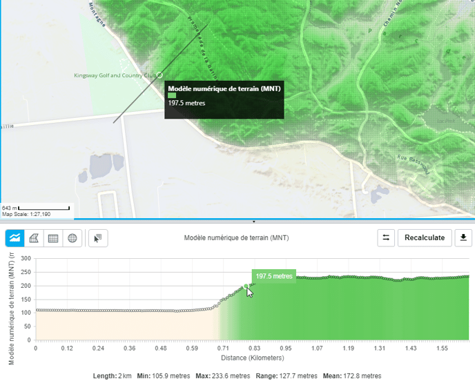
A typical analysis use case is with elevation data where you want get a chart that displays the elevation (e.g. in meters) along a path (polyline). You are interested in obtaining a linear profile that will help understand the elevation data for this segment (for instance along a road or perpendicular to the coast line for example). Check how to do this here.
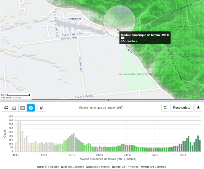
Another one is querying a polygon on the map to understand the corresponding grid statistics. Here’s an example with temperature data, “what is the average, minimum and maximum temperature for this municipality in the last month ?”. Check how to do this here.
If you want to know how to export your results, click here.
How to create a linear profile
From a new polyline
-
Select the Raster Grid Linear Profile Tool from the map toolbar or from the grid view panel

- Click on the map to draw a line, double click to end.
- The corresponding chart is displayed in the grid analysis panel

-
When working with polyline geometries, the grid analysis view builds a profile of the grid data. When mousing over the chart, the corresponding point is highlighted on the map.
The chart displays the data points along the line as well as the length of the line (in map units) and statistics:
-
Minimum
-
Maximum
-
Range
-
Mean
-
- There is the possibility to compare several profiles if you want to identify differences between multiple time data. To do so, click on the drop-down menu to choose the dates you are interested in, then click on "compare". You will then have a new graph with the selected data.

From an existing polyline feature
-
Select the Raster Grid Feature Selection Tool

-
Click on the polyline feature you want to analyze
The corresponding chart is displayed in the grid analysis panel
The object is also selected in the selection panel
You also have the ability to create N profile lines from N rasters that are part of a time series. To do that you can use the drop-down menu and click on the "compare" button. You will have the different lines that will appear on your profile.

How to create an area profile/analysis
From a new polygon, rectangle or circle
-
Select one of the freeform grid area analysis tools
The corresponding histogram chart is displayed in the grid analysis panel. When working with surface areas such as polygons, rectangles or polygons, the selected grid area is presented in the form of an histogram chart that shows the values distribution.
The chart displays the data values distribution as well as the polygon/circle/rectangle area (in map units) and the corresponding statistics:
-
Minimum
-
Maximum
-
Range
-
Mean
From an existing polygon feature
-
Select the Raster Grid Feature Selection Tool
-
Click on the polygon feature you would like to query
-
The corresponding histogram chart is displayed in the grid analysis panel. When working with surface areas such as polygons, rectangles or circles, the selected grid area is presented in the form of an histogram chart that shows the values distribution.
How do I Export my Chart ?
-
Click on the Chart Export Button

-
Choose from the menu to
-
Export the chart to an image format in Portable Network Graphics (PNG)
-
Export the chart to an image format in Scalable Vector Graphics (SVG)
-
Export the chart data (coordinates and values) to Microsoft Excel.
-
Other Chart Tools
Reversing a Linear Profile
![]()
Choose the reverse button to reverse the profile. The starting point becomes the end point.
Recalculating the Grid Statistics

Choose this button to recalculate the analysis. As you zoom in closer, your grid data may become more accurate with more data. You can then use this button to get a more accurate profile or analysis.